Group:
Print Production: Digipak (Jack), Pull out sleeve (Alex),
NME Magazine back page (Cameron)
Pitch
Candidate 5129:
Candidate 5129:
Sample of log entry
Candidate 5042
Candidate 5042
Sample of log entry
Candidate 5167:
Candidate 5167:

 Today hasn't beena fantastic day. After working on the evaluation edit for some three hours, staying behind at school until six, I had to save the final edit to my memory stick because I would not have been able to 1) save the file to the hard-drive and then send it in an email to my home email or 2) save it to the hard-drive before uploading it to YouTube because the caretakers needed to shut the school by six thirty. This meant that I had to wait for an hour whilst the video saved to my memory stick, however when I returned home and attempted to upload the video to Youtube, I got the error message that can be seen above. I tried to re-upload the video a number of times however this was to no avail as the same error message appeared on each occasion. I have since passed the video on to both Alex and Cameron in the hope that they can uplaod the video soon, however I am extremely frustrated because I have been working frantically all week to try and produce the best possible evaluation I can yet this problem has the potential to ruin every piece of good work I, Cameron and Alex have all produced on a tight schedule in the past two weeks. For now, I have limited our evaluation to the focus group findings from last week. I have also emailed Miss Fernandez explaining the situation.
 |
| our photo |
 |
| The Pigeon Detectives band photo |

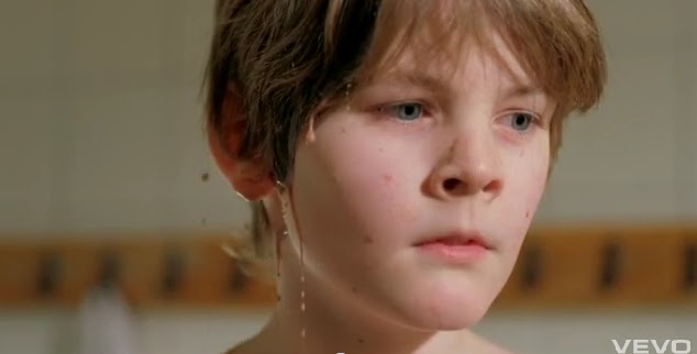
 There is also intertextuality within our work, as we studied a number of videos previous to our construction and used some interesting elements from those videos with a different take in our own. For instance, for our paint and water shots we were inspired by the work of Martin de Thurrah’s work (particularly in the video for ‘Human’ by Carpark North) and the music video for ‘No Rest’ by Dry the River. We incorporated the two styles across two different shoots, and successfully introduced them into our music video. A lot of Martin de Thurrah’s work includes the use of slow motion and liquids, which is exactly what we set out to film on our first paint shoot. Using a steadicam, we filmed Cameron at midshot distance on a 60 frames per second camera whilst paint was thrown at him. We also filmed him just afterwards and as he threw a paint pot. The end result when slowed down in premier was a fantastic shot – the fact that it was out of focus adding to the value – of paint splatting Cameron and dripping from his face. However, the fact that it was out of focus meant that we reshot the piece with a different style in mind. Having looked at the video for ‘No Rest’ we decided to imitate this and threw water and paint at him. When we played this back in Premier, it looked as if he was on a beach – and indeed, from some of our audience research we found that viewers though the same. To finish the piece, we combined de Thurrah’s use of slow motion with this, as can be seen.
 In the studio, we used low-key lighting and this when combined with an alteration of the saturation and brightness gave our video an authentic, gig performance feel. The use of spotlights, instruments and performance helps to enhance this sentiment, and therefore made our video more genuine in its appearance. Furthermore, the use of a black and white effect has helped to emphasise the darker colours within our piece, thus making the mood of the track more apparent, connoting darkness alongside the minor key track.
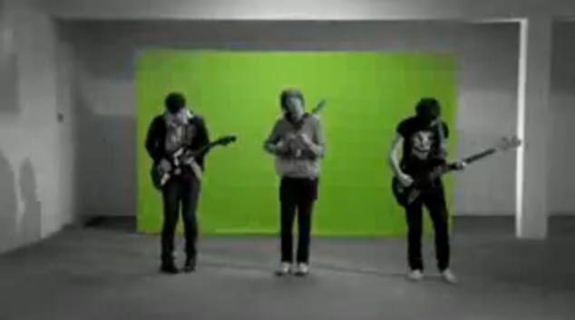
 We were also successful at conforming to generic expectations through our use of locations. Our use of a band performance on a stage can be seen in a number of indie/rock bands, such as Supergrass (Mary), Two Door Cinema Club (Something Good Can Work) and The Pigeon Detectives (Romantic Type). The use of woodlands also connotes the notions of freedom and distraction from everyday life, which inhibits the people and their actions, whereas here Cameron is free to exhibit his emotions, with no fear of being judged by society.
 We were also inspired by ‘I’m Not Sorry’ by The Pigeon Detectives, as their low-budget video connoted the sense of rebellion, fretfulness and frustration. We therefore decided to implement this aspect within our piece, focusing on the frenetic behaviour displayed by the band, which reinforced the ideological interpretation. We also decided to look at some of their live performances before we did our band performance, which allowed us to make the performance more realistic. This was evoked particularly well through Cameron’s erratic movements.
 We decided that it would be best for our adverts to follow a dominant reading path, due to the simple nature of the adverts. The band name was placed in the top left corner in red font – so it would stand out from the white background and so it would be the first thing the consumer read – whilst the main image was centred – because it was the largest part of the design and the most iconic and therefore would be the most attention-grabbing element of our piece. Cameron added the reviews beneath this and the last feature to be placed in the advert was the band website – giving the consumer the option to go and find out more about the band, hence the reasoning for positioning it in the bottom right hand corner – so it is the last thing they read and therefore the thing that will remain freshest in their mind. Although the consumers’ viewing of the advert may be brief, because we have included bold colours and a unique and appealing design – which will also identify the genre of the music, as it is an individual, exclusive piece - they will be more likely to notice it.

| Our font |
 |
| Richard Dyer |
 Both of these paradoxes are present within both our music video and subsidiary media, thus linking the two together; in our printwork, the band are seen to be absent because in the poster, booklet and majority of the digipak there is no presence of the band, however they are also present because the consumer is buying into their product and the band name is still visible. The band are seen to be ordinary in their first person mode of address by breaking the fourth wall of cinema, yet at the same time they are extraordinary as they are a band starring in their own music video. The combination of these paradoxes ensures that the consumer is left striving to complete the band’s image, meaning that they will continue to buy into the band’s products due to the incoherent incompletion of the band image despite the promise of conclusion through the music video performance.