Earlier in the week, we made the decision to (for now at least) scrap the video, as we could not get it to upload.
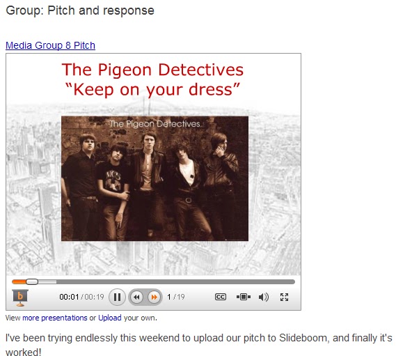
Instead, we have worked rigorously on creating a new piece in the little spare time we have had - we have all had tight work schedules. We have created a Sliderocket presentation for the evaluation question: What have you learned from your audience research?
Tuesday, 20 December 2011
Sunday, 18 December 2011
JC: Audience research - little progress

Friday, 16 December 2011
JC: Final day of term problems
 Today hasn't beena fantastic day. After working on the evaluation edit for some three hours, staying behind at school until six, I had to save the final edit to my memory stick because I would not have been able to 1) save the file to the hard-drive and then send it in an email to my home email or 2) save it to the hard-drive before uploading it to YouTube because the caretakers needed to shut the school by six thirty. This meant that I had to wait for an hour whilst the video saved to my memory stick, however when I returned home and attempted to upload the video to Youtube, I got the error message that can be seen above. I tried to re-upload the video a number of times however this was to no avail as the same error message appeared on each occasion. I have since passed the video on to both Alex and Cameron in the hope that they can uplaod the video soon, however I am extremely frustrated because I have been working frantically all week to try and produce the best possible evaluation I can yet this problem has the potential to ruin every piece of good work I, Cameron and Alex have all produced on a tight schedule in the past two weeks. For now, I have limited our evaluation to the focus group findings from last week. I have also emailed Miss Fernandez explaining the situation.
JC: In what way does your media product use, develop or challenge forms and conventions of real media products?
Looking at Andrew Goodwin’s forms and conventions of a music video, it would appear that ours in rich in connotation. Goodwin’s first feature says that music videos demonstrate genre characteristics, which are recognisable throughout music videos belonging to that genre. Before we set about our creative process, we decided it would be a good idea to look into the generic conventions of a typical music video and found that for indie/rock videos, although there is great variation in the style of different videos – due to the individual aspect of the genre – this should include a stage or band performance, a sense of camaraderie and costumes typically consisting of jeans or chinos, pump shoes, normal shirts and jackets.

 |
| our photo |
 |
| The Pigeon Detectives band photo |
When we set about the planning of our music video, we felt that it would be crucial to include at the very least aspects of these conventions, regardless of which basing (performance, narrative or concept) we gave to the overall video, because we could then compare our piece to that of both our artist and others. Despite having four different locations, and therefore four different costumes, in each one we can be seen to conform to the genre through our clothing. Furthermore, the predominant footage in our video is band performance. Whilst we were reasonably happy with the original footage, after changing the brightness and contrast on the recording we found that an authentic band performance, perhaps at a concert or gig, was given out. This can be seen in videos such as that for ‘We Don’t Celebrate Sundays’ by Hardcore Superstar. Comradeship was also evident in our video, as can be seen through our jump cuts and opening shots, where we can all be seen in the car together. The performance, which constitutes the bulk of our work, is also evidence of band union because we are all performing together. The costume and camaraderie constituents of our work are also visible in our printwork – with a band photo on the inside cover of our digipak, which can also be seen in real band posters for The Pigeon Detectives.

 There is also intertextuality within our work, as we studied a number of videos previous to our construction and used some interesting elements from those videos with a different take in our own. For instance, for our paint and water shots we were inspired by the work of Martin de Thurrah’s work (particularly in the video for ‘Human’ by Carpark North) and the music video for ‘No Rest’ by Dry the River. We incorporated the two styles across two different shoots, and successfully introduced them into our music video. A lot of Martin de Thurrah’s work includes the use of slow motion and liquids, which is exactly what we set out to film on our first paint shoot. Using a steadicam, we filmed Cameron at midshot distance on a 60 frames per second camera whilst paint was thrown at him. We also filmed him just afterwards and as he threw a paint pot. The end result when slowed down in premier was a fantastic shot – the fact that it was out of focus adding to the value – of paint splatting Cameron and dripping from his face. However, the fact that it was out of focus meant that we reshot the piece with a different style in mind. Having looked at the video for ‘No Rest’ we decided to imitate this and threw water and paint at him. When we played this back in Premier, it looked as if he was on a beach – and indeed, from some of our audience research we found that viewers though the same. To finish the piece, we combined de Thurrah’s use of slow motion with this, as can be seen.
In my opinion, the slow motion handi-cam tracking shot of Cameron throwing the paint pot is a great example of how camerawork connotes rebellion and anger. This is because it captures his movement and non-verbal language as he throws the pot, accentuating the maliciousness with which the normal speed shot was intended. The Camaraderie aspect of the genre is also captured by the inside car footage, which appears to represent a home video feel to the images, similar to the ‘lads on tour’ or group trip scenarios that youth or adolescents are often associated with. We also provided a number of close-up Meat shots for the consumer which conforms to the conventions of music videos in general.
 In the studio, we used low-key lighting and this when combined with an alteration of the saturation and brightness gave our video an authentic, gig performance feel. The use of spotlights, instruments and performance helps to enhance this sentiment, and therefore made our video more genuine in its appearance. Furthermore, the use of a black and white effect has helped to emphasise the darker colours within our piece, thus making the mood of the track more apparent, connoting darkness alongside the minor key track.
As I stated earlier, there is a certain style of clothing associated with the indie rock genre. We have been successful in replicating this convention in our work, as can be seen in the pictures where we are dressed appropriately in all situations, with the instruments of a band further reinforcing this meaning. These are also similar to the costumes worn in some promotional material by The Pigeon Detectives.
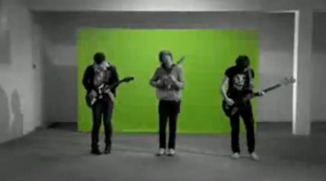
 We were also successful at conforming to generic expectations through our use of locations. Our use of a band performance on a stage can be seen in a number of indie/rock bands, such as Supergrass (Mary), Two Door Cinema Club (Something Good Can Work) and The Pigeon Detectives (Romantic Type). The use of woodlands also connotes the notions of freedom and distraction from everyday life, which inhibits the people and their actions, whereas here Cameron is free to exhibit his emotions, with no fear of being judged by society.
 We were also inspired by ‘I’m Not Sorry’ by The Pigeon Detectives, as their low-budget video connoted the sense of rebellion, fretfulness and frustration. We therefore decided to implement this aspect within our piece, focusing on the frenetic behaviour displayed by the band, which reinforced the ideological interpretation. We also decided to look at some of their live performances before we did our band performance, which allowed us to make the performance more realistic. This was evoked particularly well through Cameron’s erratic movements.
In our video, the representation of young adolescent males conforms to the indie/rock genre. Because this is the only group present, we were able to connote restlessness and youth frustration, whilst when the restrictions of the ‘real world’ were removed the rebellion and freedom that then occurs was present in our video, as can be seen through our shots of Cameron throwing the paint pot, and myself and Cameron smashing some rubbish up.
JC: How effective is the combination of your main product and ancillary texts?

 We decided that it would be best for our adverts to follow a dominant reading path, due to the simple nature of the adverts. The band name was placed in the top left corner in red font – so it would stand out from the white background and so it would be the first thing the consumer read – whilst the main image was centred – because it was the largest part of the design and the most iconic and therefore would be the most attention-grabbing element of our piece. Cameron added the reviews beneath this and the last feature to be placed in the advert was the band website – giving the consumer the option to go and find out more about the band, hence the reasoning for positioning it in the bottom right hand corner – so it is the last thing they read and therefore the thing that will remain freshest in their mind. Although the consumers’ viewing of the advert may be brief, because we have included bold colours and a unique and appealing design – which will also identify the genre of the music, as it is an individual, exclusive piece - they will be more likely to notice it.

Our digipak has a widespread, recognisable image, which has been manipulated to create a unique, slightly ironic image. The bold colours used in the piece also help our digipak to stand out from the crowd, and thus make our digipak more purchasable. We took a different approach to the Digipak than we did with the music video – create a slight tongue-in-cheek feel. I chose the images due to their link to the album title, which is unique to our piece, and then built the rest of the printwork – apart from the band photo – around this. This also creates a mischievous feel to the piece, which conforms to the dominant ideologies held about young male adolescents, because they are often associated with acts of rebellion, disobedience and tomfoolery. There is also presence of generic conventions in our digipak, as I placed a guitar – an iconic image associated with the indie/rock genre – next to the track listing on the back cover. The font used also links in with the ‘Emergency’ title and image of the man, as it is similar to fonts such as that for ‘Superman’. It is also similar to that used by The Pigeon Detectives in their album cover for ‘Up Guards and at ‘Em’. There is coherence within our printwork because both our digipak and advert use the same font and image, meaning that the album will be more recognisable to the consumer if they want to buy it. By using the same font throughout our digipak, booklet and advertisement there is consistency throughout our promotional material as each links together.
| Our font |
 |
| Richard Dyer |
Richard Dyer set out a ‘stars theory’ regarding the influence of stars across different medium. He suggest in this that these stars are semi-mythological sets of meanings constructed around performers in order to market themselves to a large and loyal audience. He says that fundamentally, the star image is incoherent, incomplete and open, which is based on two key paradoxes:
· The star must be simultaneously ordinary and extraordinary for the consumer
· The star must be simultaneously present and absent for the consumer
 Both of these paradoxes are present within both our music video and subsidiary media, thus linking the two together; in our printwork, the band are seen to be absent because in the poster, booklet and majority of the digipak there is no presence of the band, however they are also present because the consumer is buying into their product and the band name is still visible. The band are seen to be ordinary in their first person mode of address by breaking the fourth wall of cinema, yet at the same time they are extraordinary as they are a band starring in their own music video. The combination of these paradoxes ensures that the consumer is left striving to complete the band’s image, meaning that they will continue to buy into the band’s products due to the incoherent incompletion of the band image despite the promise of conclusion through the music video performance.
Thursday, 15 December 2011
JC: Updated Digipak and booklet
Following feedback on the print out of our work, we were asked by Miss Fernandez to alter the layout of our Digipak and make minor adjustments to it. Here are (hopefully) our final designs for the Digipak.
Following feedback on the print out of our work, we were asked by Miss Fernandez to alter the layout of our Digipak and make minor adjustments to it. Here are (hopefully) our final designs for the Digipak.
 |
| Alex's booklet outer cover |
 |
| Alex's booklet inner cover |
 |
| My Digipak Design |
JC: How did you use media technologies in the construction and research, planning and evaluation stages?
How did you use media technologies in the construction and research, planning and evaluation stages?
Media processes and technologies have played a crucial role throughout the advanced portfolio module.
 |
| Youtube user feedback |
 |
| Survey monkey |
 Throughout the creative process, we have used a range of web 2.0 applications to aid our production and ideas development. Using Blogger has allowed us to create a production log which can then be shared with internet users but more importantly each member within the group, which has allowed us to share ideas and alter them democratically (through a majority), ultimately leading to an end product that we as a group are happier with. YouTube, another application from the Google group was of great use for us; we used the site to upload our initial ideas, animatic, rough cuts and final videos, which allowed us primarily to embed our videos on our blog thus showing evidence of our progress, but also as a secondary research tool. Although the data collected was more qualitative (for example, the number of likes or dislikes the video receives), some quantitative data was collected from (again, for example) any comments that were left on the video, allowing us to consider whether or not to make alterations based on user comments. We also shared our work through the social networking sites of Facebook and Twitter, which allowed us to broadcast our music video to friends and followers who could also give us feedback. This allowed us to gauge an audience feeling about our piece, which was useful for our process because testing our product at each stage allowed us to see at different points whether or not the audience understood our concept. We also used SurveyMonkey in the planning stage of our concept development to test our ideas, and the feedback from this was used in our pitch and was also taken into account when we were producing our video. In addition to these we media applications, we also used Microsoft Powerpoint to create a slideshow for our pitch, and then uploaded it to Slideboom in order to embed it on our blog.
For both the Foundation and Advanced Portfolio production, the blog has been the most significant media tool used in our creative processes. It has been an excellent resource for the documentation of thoughts, write-ups and work exhibition, appearing in a more aesthetically pleasing manner than, for example, a paper document. It has allowed us to integrate examples of other artists’ work when talking about them thus allowing a reader to understand what we mean and what we are referring to, whilst also allowing us to highlight key words within our work which exaggerate the point which we want to make. Along the way, there were only minor problems I experienced with the application; when logging in, if the stay signed in box was ticked then we would be unable to comment on any posts. The image layout within each post was also difficult to alter because the image movement was not flexible, and finally the background design has been difficult to alter, because a number of the images which we have wanted to use have exceeded the alloted file size.
Our animatic was an area in which we could perhaps have improved. Although we had most of the shots we had agreed to shoot included within it, there was little description of what we intended to show within each shot so for the outside viewer it might have been a little unclear what exactly it was that we intended to show. However, despite not looking back at the animatic on a regular basis, the process of creating the storyboard was useful because it was the first opportunity we had to put together our creative ideas and grasp what they might look like.
 ICT played a substantial part in reaching our audience. Because we uploaded our video to YouTube, we were able to exhibit our music video for no cost at all. Furthermore, the use of social media sites where registration is free meant that we could also advertise our products for free. This is an attractive method for an upcoming band who will have small budgets (in the same way as The Pigeon Detectives would have had at the time the album was released).

 The use of Photoshop is for me the area where I both excelled and improved the most over the course of the production. I was initially enthused by my first concept ideas, however I was uncertain about whether or not they could be carried across into my final piece because my first drawings and designs had been made on paint. Although we ended up not using the image, the design that I found most rewarding to create was the fire alarm hand which was modified to make a guitar. It was to sit on the back cover, next to the track listing. Initially, I photographed this sign and then copied it onto my editing computer. Once I had saved the image to the hard-drive, I set about editing it in Photoshop. Initially, I extended the ‘pushing finger’ to join with the alarm button, and then rubbed out the middle knuckles of the hand. This was difficult because I had to smooth the edges in order to give the appearance that the guitar ‘arm’ was rounded. I then joined the other side by the thumb and added a black ‘dial’ to the body of the guitar, which was done simply by using the paintbrush tool and marking a single four pixel dot. Ultimately we decided to scrap this because there were concerns that it didn’t look like a guitar, however I found the process to be nonetheless useful as I gained vital experience in using the program.
 In addition to this, I also had the idea of putting a band photo in our digipak because there was otherwise no visual presence of the band members in our promotional material, and I also liked the result of our band photo on the
The font I used on the digipak design was chosen due to it’s connotations; I chose the font, named Heroes Assemble because it reminded me of the font used in comics - such as Superman - which feature superheroes. Writing the word Emergency in this font gave it superhero status in the same way that adding a cape to our emergency exit man had done, and because superheroes are often found in Emergency situations I felt this font would be a good one to use. I downloaded the font from the website Dafont.com which meant that writing it out would not result in it becoming pixelated. I then selected the normal version (i.e. not bold, in italics etc.) and wrote out the band name in the top Left hand corner (so it would be the first thing the consumer read) and the album name in the bottom right hand corner (so it was the last thing they read and therefore made the connection between then image and the name) so neither covered any of the white space.


Premier was the editing software programme we used to assemble our music video. Whilst my attention was focused predominantly on Photoshop creating our digipak – we delegated different tasks to each of us to save time – I was involved in the creative ideas process and edited a couple shots that were included in the shoot. Once we had finished filming, we captured the shots and then opened them in Premier ready to edit . For me, my most iconic piece of editing was the jump cuts from Brighton . After importing all of the shots that we had recorded, I then dragged the song track onto the timeline and then also dragged the chosen shot onto it, above the music. To begin with I moved the selected shot along to the part of the track which it roughly belonged in, and then eventually dragged it onto the point where Sam’s stationary shot lined up with the first power chord in the music. I then cut the video until I was stationary in shot, and then Alex and finally Cameron. Once this had been done, I moved them next to each other and made sure each jump cut was in time with the power chord change. After this, I dragged the selection bar across to this section of the track so that only this part would be exported. Once this was done, I saved the file to the D-Drive and once this was complete, exported it onto YouTube.
I also created the sped up Police car shots, by importing the shot into the editing timeline and decompressing time on it, and used the same tool to alter the speed of the car travelling through the tunnel towards Brighton . In addition, I also added a black and white effect to these shots, as we had done throughout the rest of the piece.
 The editing process was made a lot easier this time around, as we switched a couple of weeks into editing from Adobe Premier version 8.0 to version 9.0. Whereas previously playback had been difficult as a number of un-rendered shots would judder, our playback on version 9.0 was of good enough quality for us to be able to pinpoint where we would need to start and stop lip-synching. This was nonetheless our most difficult process, particularly considering that we had nearly five minutes worth of video to synchronise, given that our video was performance based.
  Similarly, we had only a limited number of problems with our cameras – although the major problem, battery life, was more fundamental to our construction. For instance, having made the trip down to
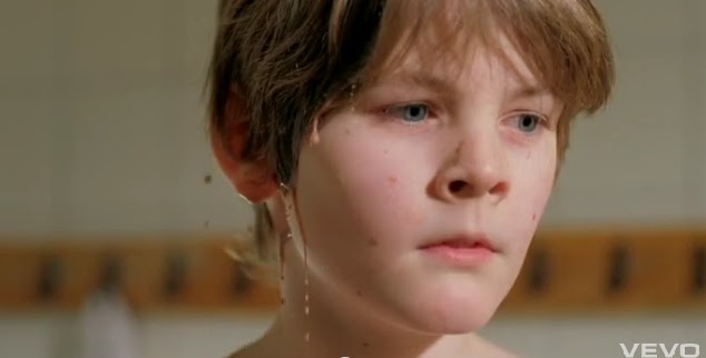
 We also used profilmic effects to construct our music video and therefore used media technologies both on set and in the editing process. Filming from a hanging frame at close-up length, we filmed Cameron on a 60 frames per second HD camera in a paddling pool with gravel, giving the visual mirage of a beach, and threw both water and paint at him. This was similar to ‘No Rest’ by Dry the River, where the band members are soaked with water. When the footage was slowed down, the ‘splatting’ looked fantastic and was the image that both we and the audience appeared to be left with. Furthermore, our use of Cameras (both a Panasonic 25fps HD camera and a Sanyo xacti 60fps HD camera) and accessories such as a Fish-eye lens and a track and dolley (in the drama studio when filming our band performance) in my opinion has significantly improved the quality of our footage.
Tuesday, 6 December 2011
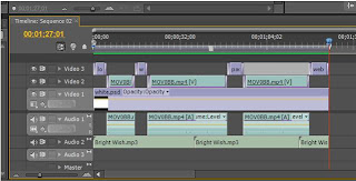
CM: Editing Process
For our music video I was editing on Adobe Premiere 10.0 at home and Adobe Premiere 9.0 at school because it gave our group extra-time outside of school to edit our production. Due to the fact that I was the only one at mine and had to make all creative decisions alone during the "home edit". Then so that the group could view the work and comment their creative ideas I would upload the footage to Youtube and then embedded it onto the blog. This allowed a group collaboration and we could then edit as a group the following lesson to change what needed changing. This has been greatly beneficial as last year for our AS coursework "Hitlist" we had only Adobe Premiere 8.0 and had poor playback taking much longer to edit. The new software has made lip-synching possible for our music video which is about 80% of our video, so our editing ability and speed has improved due to updated software.

For all our performance shots we turned the Brightness down to -33.2, the contrast and saturation up to 142.3, this made the performance seem much more authentic and the background became hidden rather than being three cardboard planks behind the band. Also by having this lighting controlled it enabled us to create the illusion of a crowd as when the camera looked out from the stage it was pitch black due to the spotlight creating low key lighting.


To create our performance base layer, we took the six different versions of our performance. Then we layered them on the time line above the audio track. Then we watched put the best performance on the top layer and when there was a inadequate bit of footage we would cut it and reveal the underneath performance we kept doing this until we had the a well cut and interesting performance video.
Our music video needed to be more than just a performance video in order to retain the interest and repeatablity for our audience. All our chorus's were intercut with abstract shots, our favoured abstract shot was the paint scene. To do this we filmed some slow-motion paint throwing and also smashing of wood/guitars/boxes, this helped to create a sense of anger and rebellion. We were inspired by Martin De Thurah's work especially "Carpark North: Human" as had slow-motion liquid to face sences. This created repeatablity within our music video, as made the audience question: why was this happening? Where is this person? Where are they performing? This helps to create a narrative fuzz and thus keeps the audience watching music video and eventually go and buy the track and so is a great promotional tool.


For the editing process it took much longer than "Hitlist" due to the amount of footage needed to retain interest and also "Hitlist" was only two minutes long. Whereas our music video was four minutes and forty eight seconds. A convention of music videos are the amount of cuts that are needed and also the many different types of shots. During our planning stage we looked at other music videos such as, Natty "July". Which had over 150 cuts, whilst watching it one didn't notice this however when technically analysing it I realised just how much footage was needed to create a captivating music video. The editing process took much longer this year than last due to the amount of cuts that were needed. However I feel we created a much better production at the end of the course.

For all our performance shots we turned the Brightness down to -33.2, the contrast and saturation up to 142.3, this made the performance seem much more authentic and the background became hidden rather than being three cardboard planks behind the band. Also by having this lighting controlled it enabled us to create the illusion of a crowd as when the camera looked out from the stage it was pitch black due to the spotlight creating low key lighting.


To create our performance base layer, we took the six different versions of our performance. Then we layered them on the time line above the audio track. Then we watched put the best performance on the top layer and when there was a inadequate bit of footage we would cut it and reveal the underneath performance we kept doing this until we had the a well cut and interesting performance video.

Our music video needed to be more than just a performance video in order to retain the interest and repeatablity for our audience. All our chorus's were intercut with abstract shots, our favoured abstract shot was the paint scene. To do this we filmed some slow-motion paint throwing and also smashing of wood/guitars/boxes, this helped to create a sense of anger and rebellion. We were inspired by Martin De Thurah's work especially "Carpark North: Human" as had slow-motion liquid to face sences. This created repeatablity within our music video, as made the audience question: why was this happening? Where is this person? Where are they performing? This helps to create a narrative fuzz and thus keeps the audience watching music video and eventually go and buy the track and so is a great promotional tool.


For the editing process it took much longer than "Hitlist" due to the amount of footage needed to retain interest and also "Hitlist" was only two minutes long. Whereas our music video was four minutes and forty eight seconds. A convention of music videos are the amount of cuts that are needed and also the many different types of shots. During our planning stage we looked at other music videos such as, Natty "July". Which had over 150 cuts, whilst watching it one didn't notice this however when technically analysing it I realised just how much footage was needed to create a captivating music video. The editing process took much longer this year than last due to the amount of cuts that were needed. However I feel we created a much better production at the end of the course.
GROUP: Audience Research ideas and progress
Rather fortuitously, yesterday afternoon we were able to gather a group of 12 peers and screen our music video to them, before asking them some questions about the piece. Some of the questions for this focus group had been thought up before we shot the piece, whilst others were made up on the spot. Cameron asked the questions whilst I filmed the sequence to ensure that we would have more than one attempt to record the data in case we missed anything out.
In total, we asked six questions:
Did the video conform to the genre?
This was probably the question where we had the most mixed reviews; although the majority of the people said yes to the question, two people both said they were confused as to why paint was being thrown at Cameron, but nonetheless said that they had enjoyed the shot. One person said that they thought the camerawork - particularly in the studio - was fantastic, whilst another said that the backlighting in the studio gave it a 'tour performance' feel.
After watching the video, what image were you left with?
For this section, the image that seven of our group were left with was the shot of paint being thrown at Cameron, whilst another thought that the slow motion shot of paint dripping from Cameron (inspired by Martin de Thurrah) was their most iconic shot. Other highlights for our peers were the shot of myself screaming into the camera, the jump cuts, archway shot and opening performance.
Is the video a good promotion of the track?
One person said they were uncertain as to whether or not the music video worked with the track, but elsewhere there was unanimous support for our video and the Keep on Your Dress soundtrack. One suggested that it could be enhanced was promoting the band within the video - by placing 'mock up' posters or similar within our music video.
What word or emotion did it evoke?
Again for this question there was clear support within the group for once word - rebellion, which was chosen by half of the group. Similar words such as anger and frustration were also chosen, with the only off topic choices being inspirational and indie.
What stage do you think the band are at in their career?
The majority of the group said that from watching the video purely, they thought that the band were at the beginning of their career, as the video had a small home-video feel to it.
Did you enjoy the video?
To our relief, our music video got the thumbs up from all of the people we surveyed.
For us, the next step now is to interpret this data and look at what that means for our evaluation - what can we gain from this research? We do however intend to continue to our audience research, with another potential focus group for both our music video and digipak/advertisment designs, and a possible questionnaire to give our research more credibility and validity. As our video has also been posted on Youtube, we can gain response from this source - through video likes and user comments.
AT: Editing Process
For our music video we were editing on adobe premiere 9.0, this was extremely faster than the previous version we were working on. This made the editing process go alot smoother, than previously when creating our movie opening, especialy as we were dealing with more footage at a faster cutting rate.
 The main editing technique we used was 'image control' this enabled us to change the brightness, saturation and contrast, this is what made our performance look authentic as we had a wooden backdrop in the drama studio were we filmed our performance and made it less evident that it was a studio instead it was meant to be a live performance on stage.
  For all our performance shots we turned the brightness down, and contrast up and then colour saturation up. This made the performance look much more authentic and gave more interesting lighting.
 To keep interest in our music video we intercut the performance with our 'abstract shots' In our abstract shots we decided to have it juxtaposed with the performance and used it to increase our cutting rate, for example when the tempo builds up in the chorus we have constant intercutting of driving along shots. This was then transformed into black and white again using the image control turning saturation right down (black and white) contrast turned up to bring out the backdrop more then brightness down to create a better feel for it.
 We were inspired by Martin De Thurah's work especially the use of slow motion, this was to connote the rebelion in a different way to normal conventions, this is evident in the indie genre breaking mainstream conventions. In order to slow down the footage we had to shoot it in 60FPS, then slow it down by half speed.
The main editing technique we used was 'image control' this enabled us to change the brightness, saturation and contrast, this is what made our performance look authentic as we had a wooden backdrop in the drama studio were we filmed our performance and made it less evident that it was a studio instead it was meant to be a live performance on stage. For all our performance shots we turned the brightness down, and contrast up and then colour saturation up. This made the performance look much more authentic and gave more interesting lighting.To keep interest in our music video we intercut the performance with our 'abstract shots' In our abstract shots we decided to have it juxtaposed with the performance and used it to increase our cutting rate, for example when the tempo builds up in the chorus we have constant intercutting of driving along shots. This was then transformed into black and white again using the image control turning saturation right down (black and white) contrast turned up to bring out the backdrop more then brightness down to create a better feel for it. We were inspired by Martin De Thurah's work especially the use of slow motion, this was to connote the rebelion in a different way to normal conventions, this is evident in the indie genre breaking mainstream conventions. In order to slow down the footage we had to shoot it in 60FPS, then slow it down by half speed.Monday, 5 December 2011
JC: Video feedback
On Monday, we had a viewing session of every group's videos and printwork. This was particularly useful given that we are now starting the evaluation process, as it gave us some constructive criticism and audience feedback on our works.
From a simple questions and answers piece from Miss Fernandez, we found that the most striking image that the class were left with was the use of black paint. A restless theme was recognised, and we were encouraged by the fact that nobody felt that the video dragged, especially considering that it is nearly five minutes in length. The one area that was highlighted as possibly not working was the use of the sped-up police cars.
In terms of what we could then go on to ask in any research questions, we were given three starters; what do the audience think of the artist? What point do they think they are at in their career? and what emotions does the video evoke?
Subscribe to:
Comments (Atom)